Giving Clients the Power to Brand Their Fundraising Sites
Company
DonorDrive
Project Timeline
May-Nov 2023
My Role
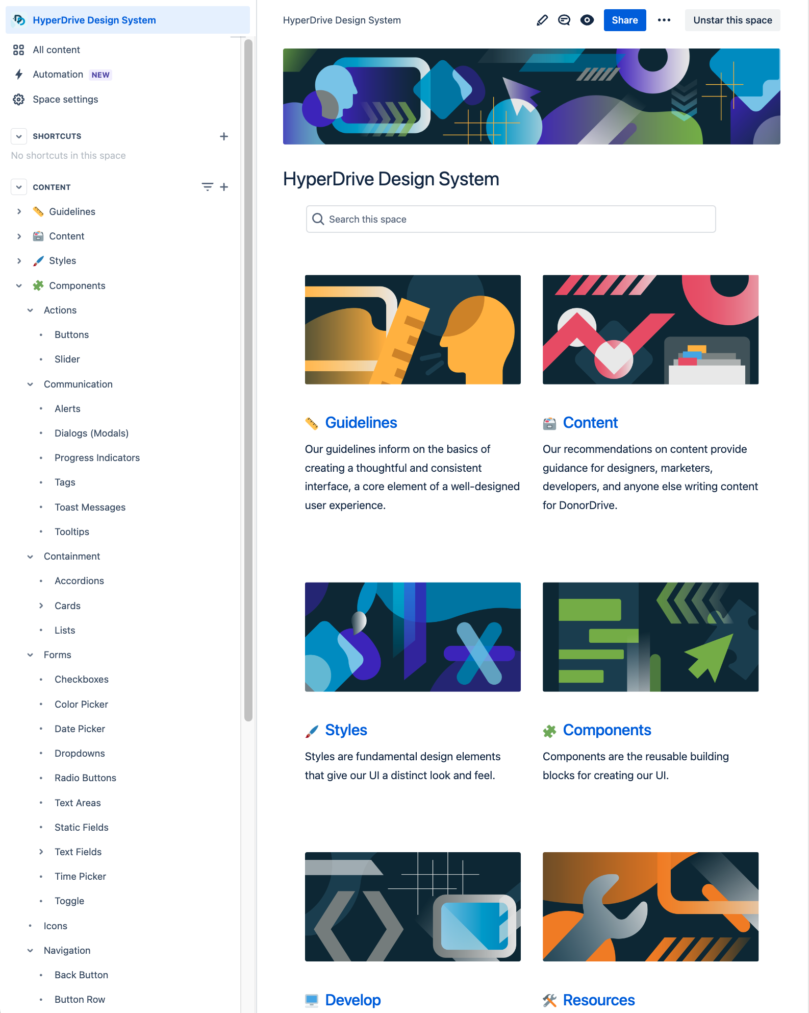
As a senior frontend developer leading our design system efforts, my role was to help build the solution, taking into account user research, technical constraints, business needs, and timeline considerations. In the process, we deployed over two dozen new design system components to support the new workflows and made crucial decisions with our implementation of Vue.js as the JavaScript framework powering our frontend.
Overview
DonorDrive is an online fundraising platform that enables enterprise nonprofits to manage events and donation campaigns that raise money for their causes.
The public-facing side of our product employs themes that are intended to reflect an individual organization’s look and feel. We offer custom-built themes that clients can pay for and rely upon our team to create and maintain. These projects take time and investment, though.
To help nonprofits fundraise faster after signing on and to lower the barrier to entry, the Color Palettes & Fonts feature allows organizations to apply any colors and select from 300+ fonts to brand their fundraising sites.
Problem
DonorDrive has four built-in themes, each with a handful of predetermined color palettes that clients were unable to change. These are the themes we chose to add configurability to as part of this project.
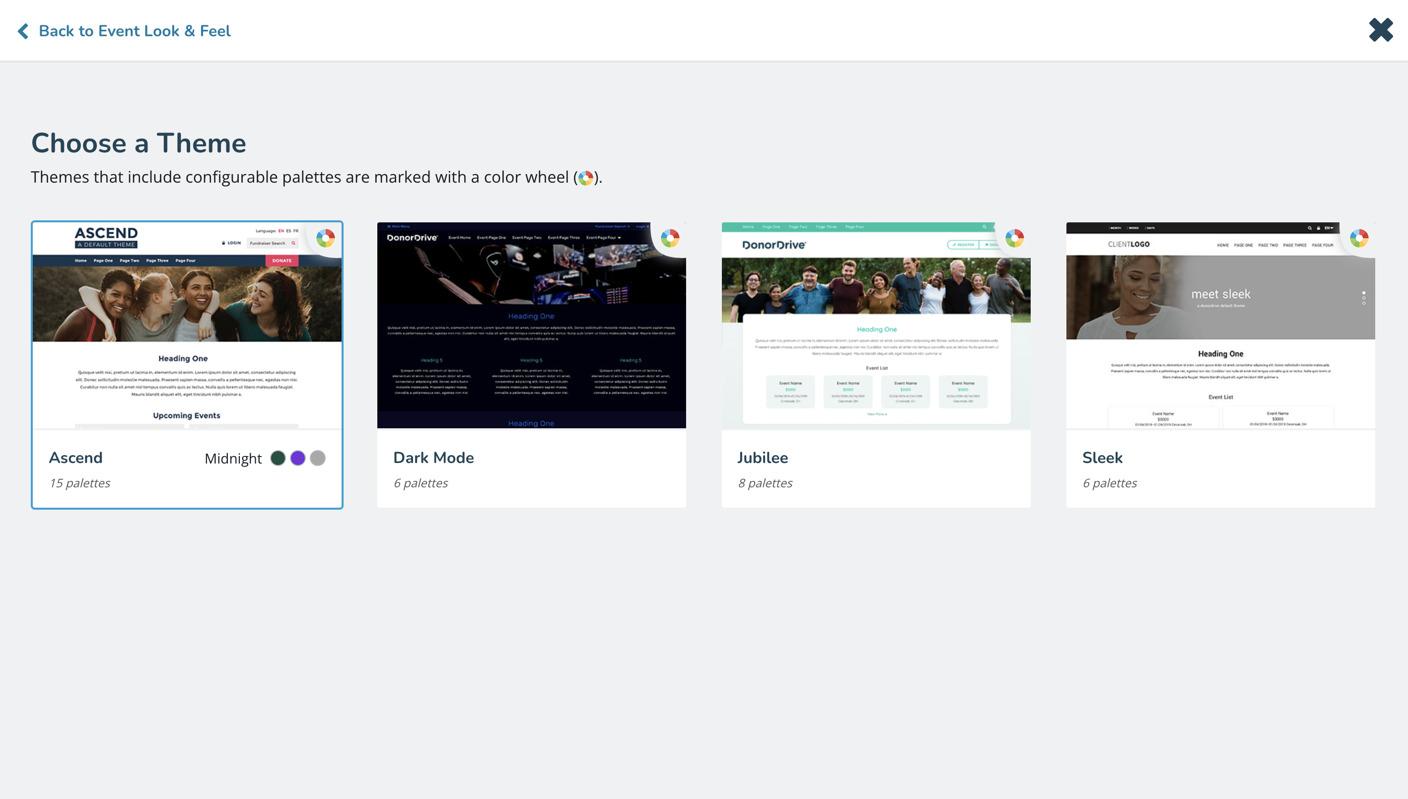
The only way a nonprofit could showcase their unique branding was through contracting DonorDrive’s design team to build a custom theme.
This meant new clients on the platform would often not raise their first dollar for weeks if not months after they had signed on. Additionally, the investment of a custom theme could impact whether a nonprofit chooses our company or a competitor during the sales cycle.
Solution
From the early stages of the project, I was involved to help shape both the admin-side experience that allows clients to create and manage custom palettes as well as the technical implementation of the public-side themes that apply those palettes.
Admin
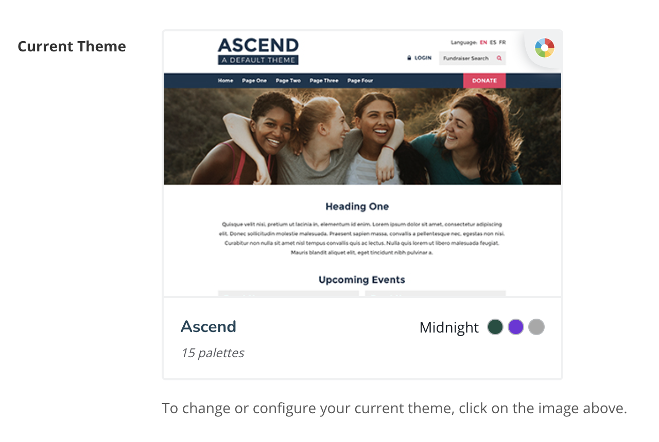
DonorDrive gives admins the option to apply a theme at a number of different levels, including the entire site, an event template that a group of events can adopt, an individual CMS page, and an individual event. Our new workflows began from these existing entry points to ensure a high degree of discoverability.
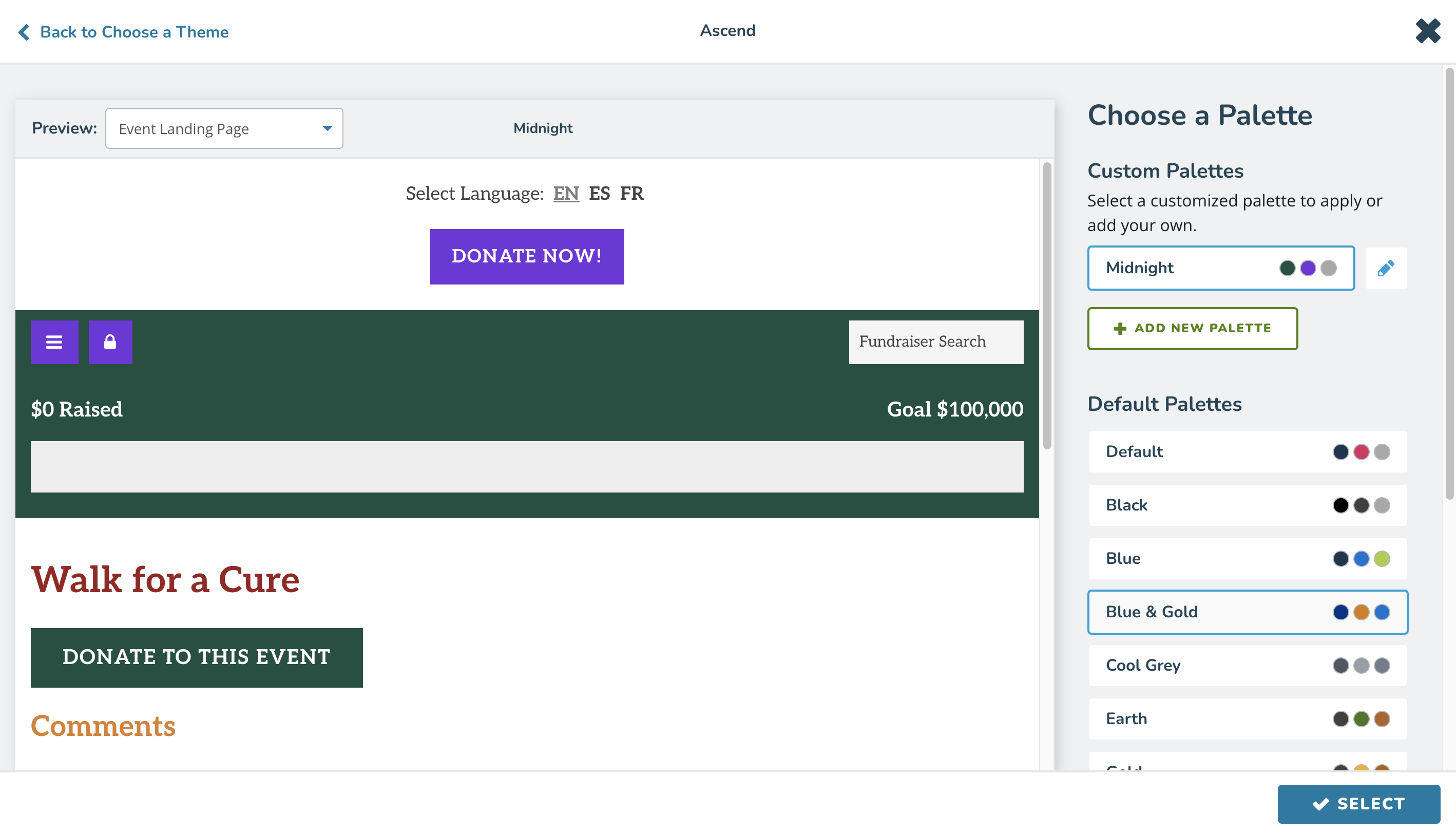
Our iterative process included rounds of user research, which the project team would review, discuss any shortcomings of a prototype draft, and decide on the best path forward to alleviate those issues. Hearing directly from our users, we were able to pinpoint specific areas of improvement, such as adding an edit button to each of the custom palettes, rather than relying upon a user to select a palette and click an edit button in our sticky footer.
We created new dialog, card, slider, and form components to carry out an API endpoint-driven user flow. I helped build these components using our in-house, unique Vue.js system in concert with our ColdFusion backend, as well as component and variant CSS classes that apply custom properties that we intend to leverage on the public side through themes.
Colors
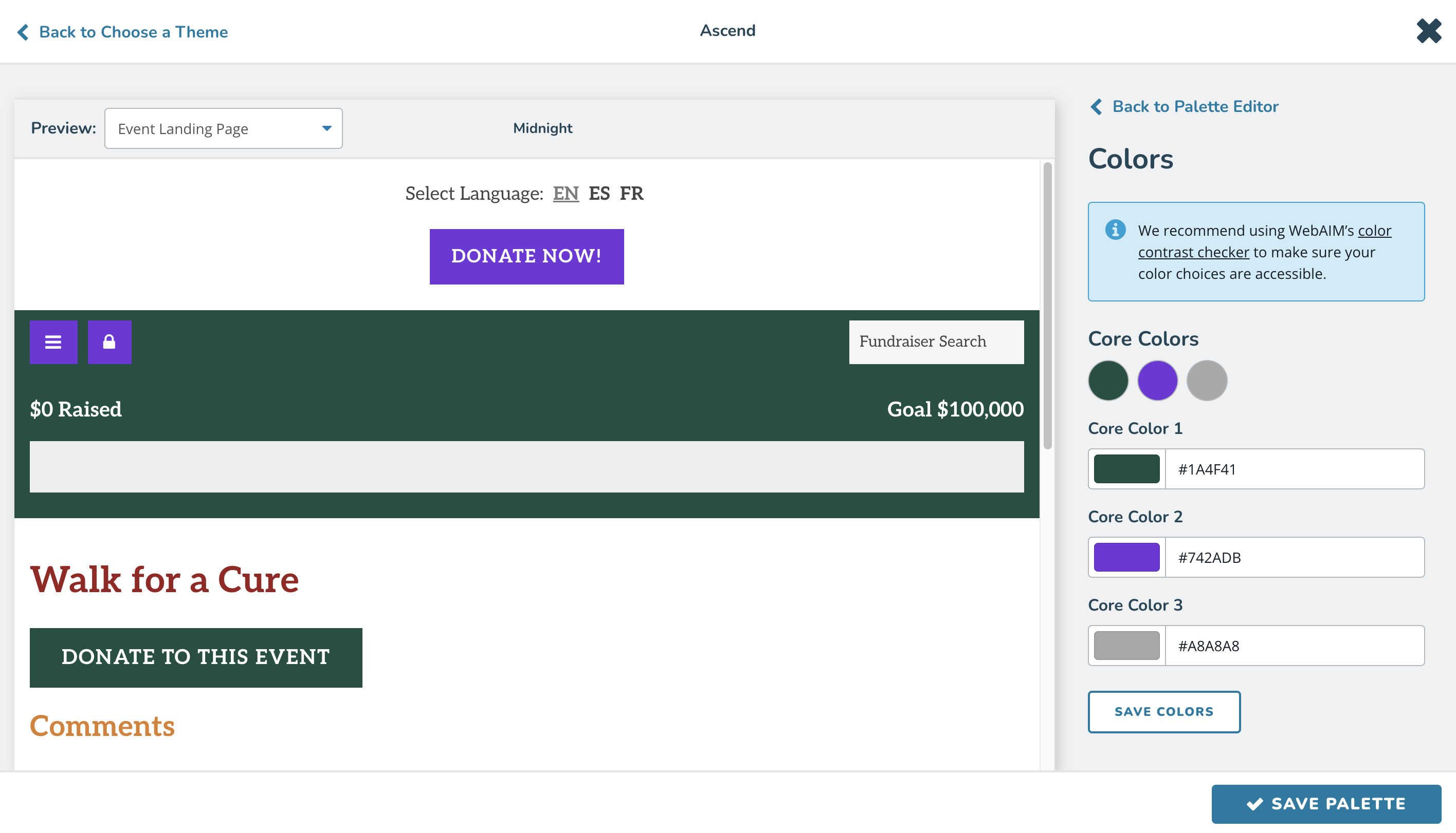
Each built-in theme required a palette configuration file that determined the fields that can be edited within each custom palette.
Additionally, each of the predetermined default palettes that were in use required a JSON file with hex values for each palette. These core colors needed to be binded to elements so that any edits to colors would be reflected both within the preview window and, if the palette were saved, on the public side.
To ensure accessibility and to hook directly into our Vue.js system, we created a custom color picker component to accomplish this task.
Fonts
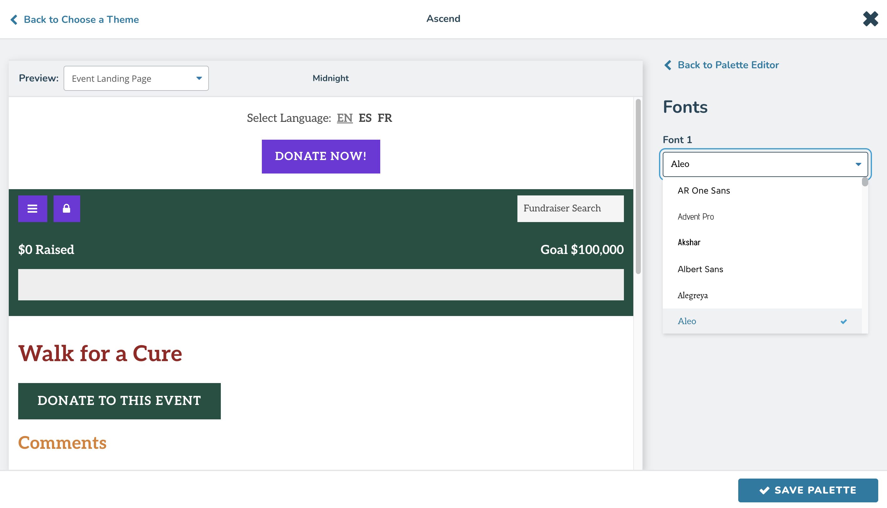
Our list of 300+ fonts that clients would be able to choose from are populated via the Google Fonts API, and filtered to use only variable fonts.
This font picker component was also custom-built and, like the color picker, inherited styles from a base form component. In the case of the color picker, we're inheriting from the text input, and with our font picker, we inherit from the dropdown.
To ensure performance, each of the options within the select tag of our font picker downloads only the characters needed from the Google Fonts API, lowering the request size considerably.
Elements
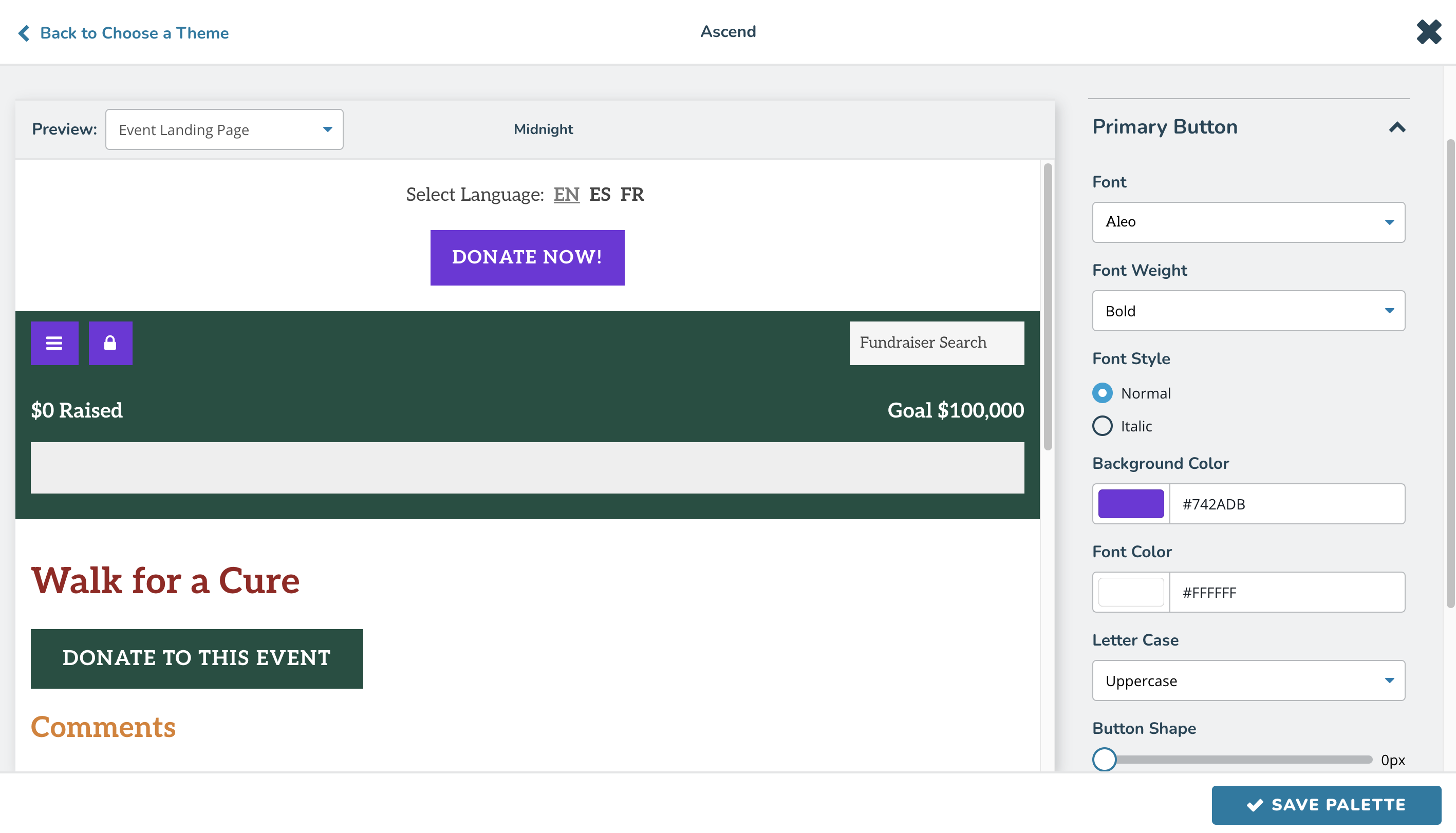
In addition to customizing a palette with colors and fonts, we opened up a number of elements to be editable. This included buttons, headings, and fundraising-specific elements like thermometers.
Individual CSS properties could be changed, and thanks to feedback from our second round of user testing, we were able to concisely but not too technically describe properties such as text-transform and border-radius with more clearly understandable names: "Letter Case" and "Button Shape."
Public
Ultimately, all the work on the admin side of our feature only mattered if the public side could display custom palettes.
We were able to tap into the power of CSS custom properties to apply these palettes in an efficient and highly maintainable manner. A good amount of work went into adapting our built-in themes' CSS, converting Less color functions to use CSS's color-mix functional notation. This way, users would need to pick only two or three core colors, and our CSS would handle hover states and slightly different background colors to provide depth.
Also, we built a color contrast checking functionality that would compare a foreground color against a background color, and if those colors didn't pass the WCAG AA accessible contrast ratio, we would automatically supply white or black text.
Conclusion
Overall, I'm very proud of our team's efforts in giving clients more control over how their public-facing themes look, ensuring that constituents could trust in the brand they already know and give confidently.
This is only one of the many large features I've had the pleasure of working on at DonorDrive, but it's easily my favorite as we were able to make great strides with our design system, our Vue.js implementation, and enabled us to push forward a very helpful tool for our userbase.
